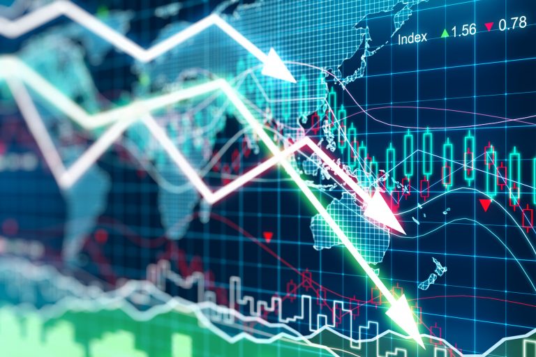
Tracking the COVID-19 economy
Our new fiscal firepower heat map, updated through December, shows how G20 COVID-19 crisis spending now compares to the Global Financial Crisis. While nearly every country is deploying its fiscal firepower significantly more than a decade ago, China is still spending less. The new US fiscal package means the US has the largest response of any advanced economy.
Check out the interactive map and accompanying charts below to learn more about how each country is spending.
Note: All these graphs are interactive. Hovering over the graphs reveals details. By clicking on the variables in the legend, they can be removed or added to your liking.
Most advanced economies experienced a remarkable economic rebound in Q3. But with the return of restrictions and lockdowns, can this rebound be sustained through 2021?
Global debt continues to rise to alarming levels and will be the theme of the conversation in 2021. The map below illustrates current levels of debt as a portion of GDP and the change from 2009.
Unemployment trends have varied at different stages of this crisis. This tells us about both, labor markets and the effectiveness of the government’s response. Youth unemployment is especially harder to compare, as NEET (Not in Education, Employment, or Training) means different things in different countries. For example, Japanese teenagers are less likely to pursue employment opportunities than their American counterparts, which is then reflected in the data. The jobs recovery is leaving behind the world’s youth. Our analysis shows youth unemployment remains particularly high in the US.
At the intersection of economics, finance, and foreign policy, the GeoEconomics Center is a translation hub with the goal of helping shape a better global economic future.